If you’re prone to a tipple of craft beer, chances are you’re more than familiar with the work of Wellington creative, art director and artist, Anton Hart.
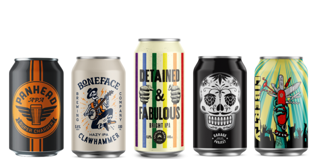
For more than 20 years, he’s been the force behind the aesthetics of multiple, high-profile Kiwi craft breweries: Tuatara, Panhead, Liberty Brewing (beer and gin), Garage Project, Fork Brewing, Boneface and Shining Peak.

Self-effacing and softly spoken, Anton’s beer art speaks volumes. Though far too modest to ever say so or even agree, Anton is a pioneer in beer art and design.
One of the first — if not the first — on the scene, he’s seen the rise and rise of package design; from a “nice to have” in the early, halcyon days to a crucial tactic in brand and marketing strategies.
And he’s got the gongs as proof: notably, NZ Best Design Awards for that iconic Tuatara bottle (more on that later) and Panhead’s special release Canheads series.
Beer and can art are akin to music and album art. Whether we know it or not, aesthetics are one of the driving forces behind plucking a particular beer off the shelf.
“Brewing beer — in craft form — is a creative process,” he says. “You’re approaching the process a bit differently. So it’s the same when it comes to its visual story: the un-templated creative process — that’s what makes it stand out,” says Anton.
“Today that seems obvious, but back in the day, it wasn’t. It was more about a single design and some information, and not creative ideas that showed the personality of a brand.”
In the late-90s, big breweries were dishing up party-amped, Saatchi-driven ad campaigns (“It’s red, mate — like a fire engine!!”). Inherently, Kiwi craft beer was almost anti-brand. The beer, its ingredients, and the process spoke for themselves.
However, when an up-and-coming brewery on the Kāpiti Coast called Tuatara approached advertising agency Y&R on how to present its new format of beer, Anton found himself in the position of giving the brewery its unique identity.
“I was working at Y&R and got tasked with it. That was the first beer brand I worked on.
“It was such a great job because it touched on all the things I loved: typography, design, art.
And I could apply it to this very new, fun, exciting product. There weren’t many other craft breweries, and no one looked at it as an opportunity to do interesting work. We had a loose creative brief and just had fun with it.
“My experience in advertising and design really came into play here. You have this very small frame — the label — and to make that work on a shelf alongside other established products took a lot of innovative thinking.”
The result for Tuatara was craft in every sense: the label featured the name of the beer style — colour-coded, words only — in bold, wood-type print (made from an old vintage printer in Foxton), set against a neutral backdrop the shade of a paper bag.
Somehow bold and understated at the same time, the brand vibed with just about everyone: young, old, corporates, hipsters, bogans, IT nerds, bohemians.
“That had amazing cut-through at that time. People were talking about it: ‘Hey, have you seen that new beer?’,” says Anton.
He eventually broke out on his own, pairing up with Ken Double and John Fish of Wellington boutique agency, Double Fish. Tuatara followed him.
“From there, it was this sort of beautiful growth of a cult brand. How could you take something like a label and turn it into something bigger? Ken wrote beautifully witty copy that had this dry, Kiwi observational tone to it. It took a sneaky poke at mainstream beer, like the NZ APA’s ‘Did I hurt your widdle tastebuds?’ campaign.”
From there, it was this sort of beautiful growth of a cult brand. How could you take something like a label and turn it into something bigger?
— Anton Hart
He says people get immune to things quickly, so the team let fly with creative approaches unburdened by traditional approaches to brand.
“We had a bit of fun with packaging for limited releases: Tuatara Blacklight, the label was UV-reactive; Double Trouble IPA came with 3D glasses you could gaze at the label with; we were the first to do mixed six boxes, and even the Tuatara bottle opener. It was a visual relationship that told you about the product.
“You don’t have to do lots of those things, but doing something really interesting now and again keeps people tuned in.”
Then there was the Tuatara bottle featuring the spiny ridge, the gnarly scales — a sculptural bit of glassware paying homage to Aotearoa’s national living fossil.
“The bottle was big. You could look at it without the word “Tuatara” or anything else on it, and know the brand was related to the bottle. Purely a textural relationship back to the tuatara itself,” says Anton.
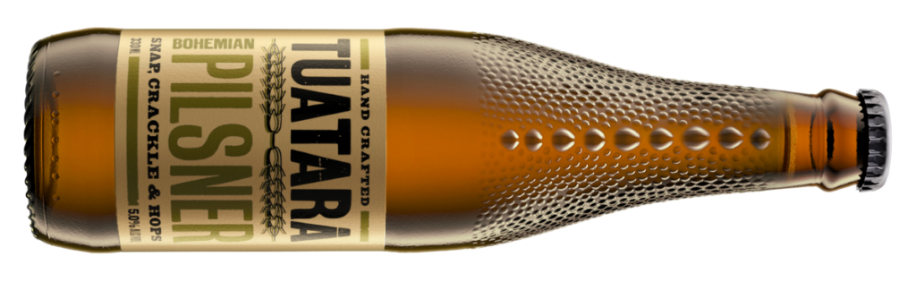
“It was a simple idea I had that took a lot of work to make happen. The casts had to be made overseas by O-I Glass; six different texture variations so there was variety in the bottles on the shelf.”
It wasn’t long before a young brewer named Mike Neilson approached Anton to create a brand for a new brewery he wanted to start up called Panhead.
There, Anton had the opportunity to create a new brand in a completely different era — and market — of craft beer.
“There were more breweries opening; people knew what craft beer was, and not only were breweries having more fun with their labels on releases, their product needed to stand out on the shelf even more, because there were more of them.
“We had this concept of ‘the cool bogan’, tying back to Mike and the brewery’s roots in the Hutt Valley, and using block colours to inform drinkers about beer styles. Again, that’s obvious now, but previously, there was no need to — draught beer was all there was!
“We avoided templated approaches to brand guidelines, using completely different looks for limited or special releases like the Canheads, creating biker personalities for each style.
“When we ended up taking on LIberty, it was another brand personality again, so we wanted another approach. Liberty cans rely more on a different look for each release, but the Liberty torch was the element we incorporated every time.”
How design has changed beer
So how much has changed in the space of Kiwi beer design?
“What’s most apparent is just how many people are working in this area now. All you have to do is walk into a bottle store and see how many SKU codes there are, which means there are designers, illustrators, writers behind every one.
“And now with social and digital media, you have a chance to bring what you create to life, it’s not just about a can label. Craft beer has led to a new medium to work with, creatively, that wasn’t there before.”
He also realises how fortunate he is to have worked at the forefront of a burgeoning industry.
“It was young and there weren’t massive marketing budgets, but, ironically, there was a lot of awesome brand engagement we were allowed to create that probably wouldn’t be prioritised today — like those beautiful Tuatara bottles or tuatara bottle openers that removed caps with its mouth. Priorities are different.”
Today, Anton hones his creative vision as an artist, focusing on sculpture exhibitions. He still dips his toe in the proverbial pint: he’s behind Boneface’s recent brand refresh and Shining Peak’s label art.
“Everything I’ve done to this point, in commercial design, has fed into my art practice. Creative concepts, design, writing — I wouldn’t be making these sculptures without the work I’ve done in the craft industry. It’s allowed me to continually flex that creativity.”
The creativity is always the best part of the process, he says, and it’s why he continues with it today.
“It’s the thinking about what it could be, the idea behind it. Because everything else is execution. But working with Ken, the breweries, the collaboration with art and words, having those human conversations that bring about the clever concept that clicks with others… It’s a nice way to work.”